Multiple Exposure Techniques for Minimalism
A minimalistic multiple exposure image of a windfarm
Introduction
Minimalism in photography is often described as the art of saying more with less. It’s about stripping an image back to its essential elements and allowing space, shape, tone, and subtle detail to do the storytelling. Rather than filling the frame with information, minimalism invites the viewer to pause, breathe, and notice what is there.
A key concept within minimalism is negative space. This refers to the areas of an image that surround your main subject — often empty or uncluttered parts of the frame. Negative space isn’t just “nothing”; it’s an active compositional tool. It creates balance, directs the viewer’s eye, and can evoke feelings of calm, isolation, simplicity, or even quiet tension depending on how it’s used.
Minimalistic images often feel peaceful, contemplative, or slightly surreal. They give the viewer room to think, rather than telling them exactly what to feel. That’s one of the reasons I find them so appealing — they invite interpretation rather than explanation.
At first glance, it might seem counterintuitive that multiple exposure, which involves layering images, could work so beautifully with minimalism. Surely adding more visual information would make things busier, not simpler? But with the right compositions and plenty of space to work with, multiple exposure can actually enhance minimalism. It allows you to introduce subtle textures, repeated forms, or gentle movement without losing that sense of openness. And most importantly, it’s easy, fun, and incredibly effective once you start experimenting.
I’ll be sharing some of these techniques on our upcoming trip to Budapest, where I’ll be co-hosting a workshop with the wonderful minimalist photographer Helen Trust — so if this style of work excites you, you’ll be in very good company.
A minimalistic multiple exposure image of the trees
Taking Tiny Subjects and Using Textures
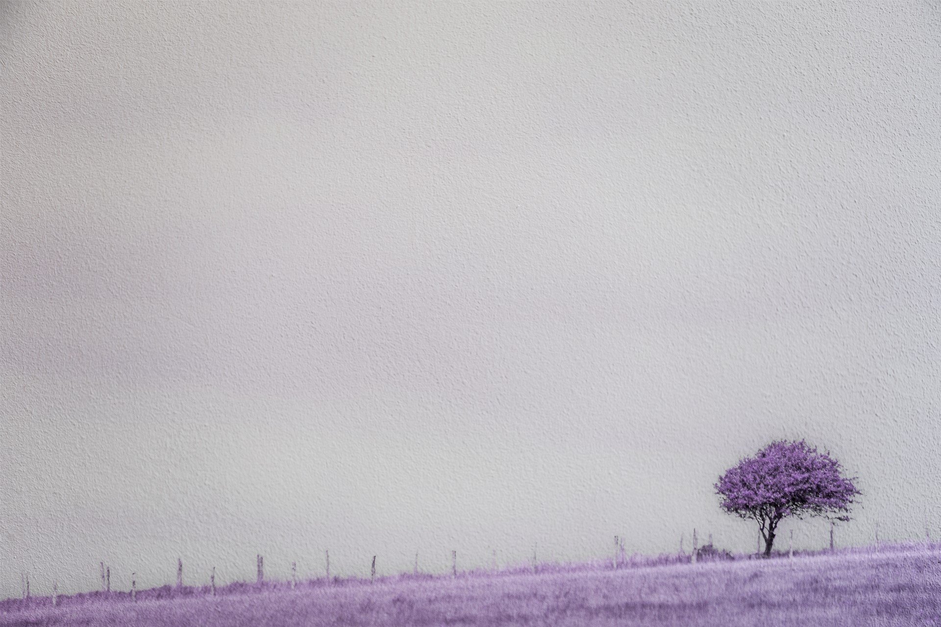
One of my favourite starting points is working with tiny subjects and then adding textures. I’ve found that using textures on images that were already carefully composed as minimalistic single frames works particularly well. The key is that the original image must already have strong negative space - the texture should enhance the mood, not rescue a weak composition.
A simple trick I often use is to place the subject low in the frame, usually near the bottom. This naturally leaves a large area of empty space above, which is perfect for minimalism. To achieve this, I often use a wide-angle lens and deliberately exclude more of the foreground than I normally would. It feels strange at first, especially if you’re used to filling the frame, but it’s incredibly effective.
In my tree image (shown above), for example, the original scene worked well compositionally but the sky was quite busy and distracting. I also changed the colour (sorry to disappoint, this isn’t the famous Madagascan purple lavender tree!) By overlaying textures of white paint, I was able to calm the sky down and turn it into a soft, abstract space. The tree remains the anchor of the image, while the negative space becomes part of the story rather than a problem to solve.
This approach works particularly well when you think of textures not as decoration, but as atmosphere. They can soften, simplify, and unify the image, helping everything feel more intentional and less literal.
A minimalistic multiple exposure image of Freedom Bridge in Budapest
Using Textures and Birds
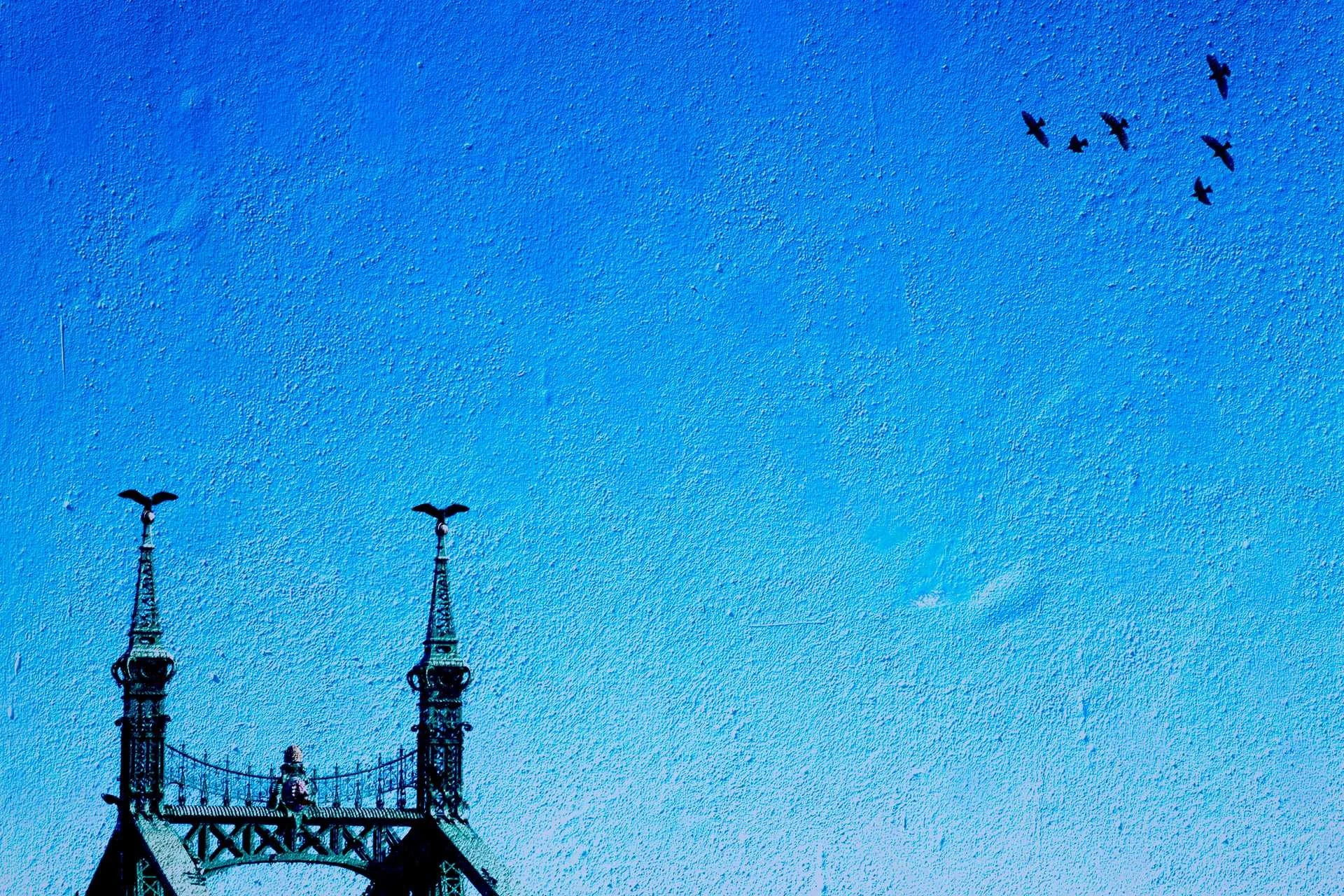
Clearly I’m going to want to use birds - it’s my thing. But beyond personal obsession, I actually really like birds as a compositional element within minimalistic images. They’re small, dynamic, and immediately draw the eye, which makes them perfect for adding just a hint of narrative to an otherwise very simple scene.
Strictly speaking, the image might be considered more “minimal” without the birds. But I rather like them being there. They introduce a sense of scale, movement, and life without overwhelming the frame.
In the image of the Freedom Bridge in Budapest, for example, the structure itself is already strong and graphic. There was a tree in the right-hand corner of the original shot, and although the image was still fairly minimalistic, I didn’t like how it sat visually. I removed it and I added birds to that corner to balance the composition. The birds become a subtle counterweight to the bridge.
There’s also a texture layered over this image, and with the chosen blend mode it brings out a beautiful blue tone. The result feels more painterly, which I love - it moves the image away from documentation and into interpretation.
A minimalistic multiple exposure image of a beach scene (with added birds)
Tiny People
I’ve really got into photographing tiny people recently. It’s fascinating to look for scenes where human figures can be reduced to small details within a larger, simpler environment. Beaches, piers, promenades, and bridges are perfect for this because they naturally create clean lines and open space.
For one particular image, I actually lay down on the sand to get the right angle. From that low perspective, the people became tiny silhouettes against a vast, high-key background. Choosing a high-key approach made the figures stand out even more, while keeping the overall image light and airy.
I then took a separate image of the sand I was lying on and used that as a texture layer. It added subtle detail without disrupting the negative space. And yes - I added birds as well. At this point, it’s practically a signature.
What I love about tiny people in minimalism is the emotional response they often trigger. They can evoke feelings of loneliness, freedom, scale, or insignificance, depending on how they’re placed within the frame. They remind us how small we are in the world, which is a powerful theme to explore visually.
A minimalistic multiple exposure image of a wind farm
In-Camera Minimalistic Multiple Exposures
Not all multiple exposure work has to happen in post-production. Sometimes it can begin - and even end - entirely in camera. This is especially effective when your subject is already small and well isolated.
One simple technique is to move the camera slightly between exposures. If the subject is small enough, this creates a gentle repetition or echo effect without filling the frame. In my wind farm image, I used the shape of the turbines and shifted the camera just enough to create layered forms that still felt clean and graphic.
I later added a texture and used the remove tool to make the sky more homogenous in both texture and colour. But the core of the minimalism came from the in-camera process, the multiple exposure itself created the structure of the image.
This approach feels more playful and intuitive than working entirely in software. You’re responding to what’s in front of you, making decisions on the spot, and letting the camera become part of the creative thinking process.
A minimalistic multiple exposure image of St Paul’s Cathedral
Crosshatching
Yes - you knew this one was coming!
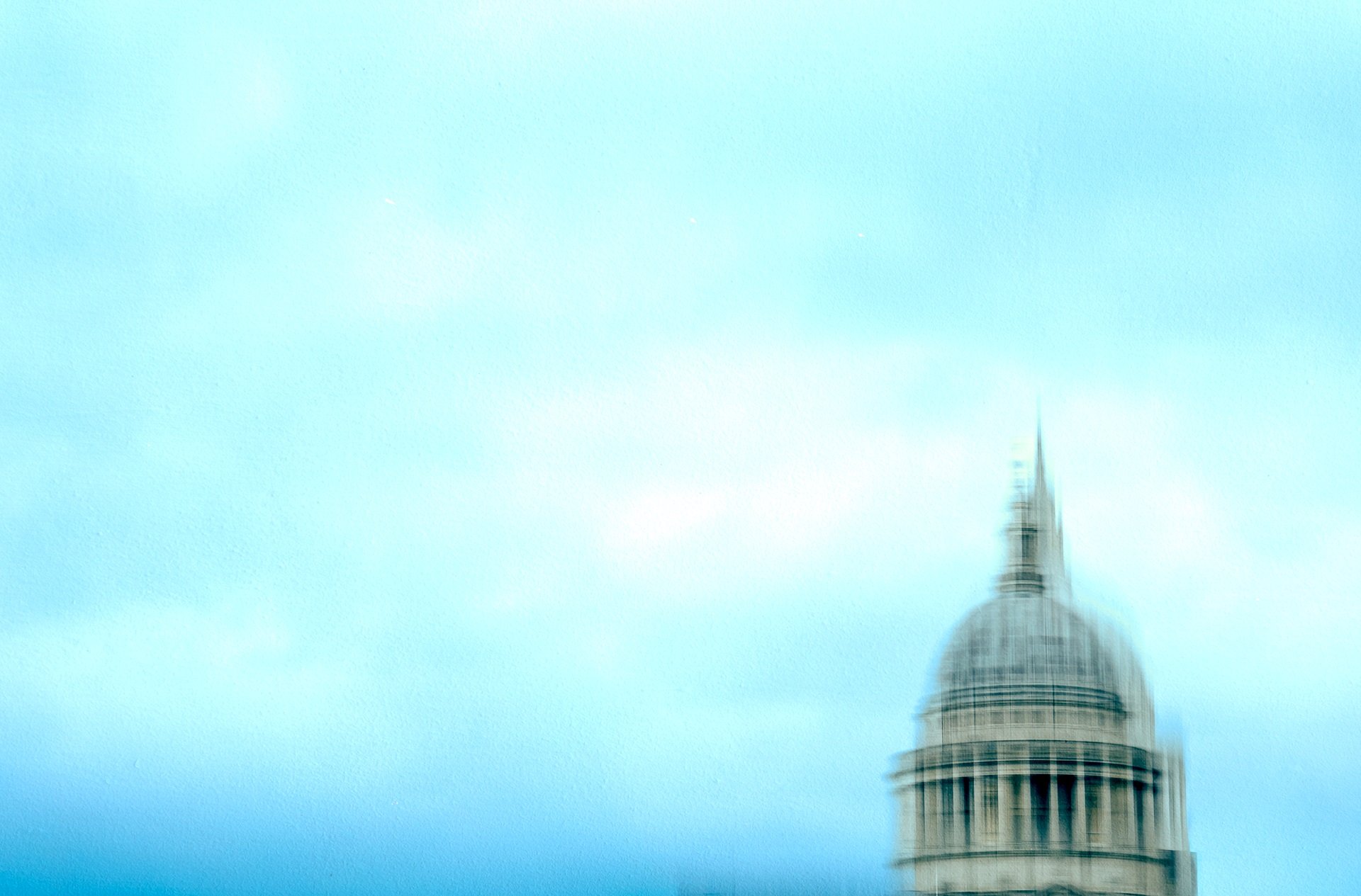
Crosshatching is something I’ve only recently started exploring, but it’s already become one of my favourite techniques for minimalistic scenes. In simple terms, crosshatching involves moving the camera vertically for one exposure, then horizontally for another exposure. The result is a subtle grid-like or woven effect, where lines and shapes repeat and intersect.
It’s a brilliant way to simplify complex architecture or strong graphic subjects. Instead of one literal representation, you get a layered, abstract interpretation that feels more like a drawing or etching.
In my crosshatched image of St Paul’s Cathedral, the technique transformed a very recognisable building into something more atmospheric and expressive. I did use the remove tool a little afterwards, so don’t worry if your composition includes a couple of elements you couldn’t avoid on the day. In my opinion, an image should be what you want it to look like - not necessarily what you were physically able to fit into the frame at the time.
Crosshatching is particularly exciting for minimalism because it allows you to keep strong shapes while reducing visual noise. It’s structure without clutter.
A multiple exposure image of the Parliament building in Budapest
Conclusion
Minimalism and multiple exposure might seem like unlikely partners, but together they create a wonderfully rich creative space. By working with negative space, tiny subjects, textures, subtle movement, and techniques like crosshatching, you can build images that feel layered yet simple, expressive yet calm.
Whether you’re adding textures to carefully composed single images, introducing birds or people as delicate details, or experimenting with in-camera techniques, the key is always the same: start with strong compositions and let the multiple exposure enhance what’s already there.
If you’ve enjoyed this blog, I’d love you to leave a comment below, join the newsletter, and come and say hello in the Multiple Exposure Hub on Facebook - it’s a lovely community of creative photographers sharing ideas and experiments.
And if this way of working really excites you, I’d absolutely encourage you to join Helen Trust and myself in Budapest this October. It’s an incredible opportunity to explore one of Europe’s most photogenic cities through a minimalist and creative lens. There are only three places left on this trip, and with locations like the stunning Parliament building, it really is something special - so don’t delay!


